
The 12 Most Readable Fonts for Print
Serif and Sans-Serif Guide

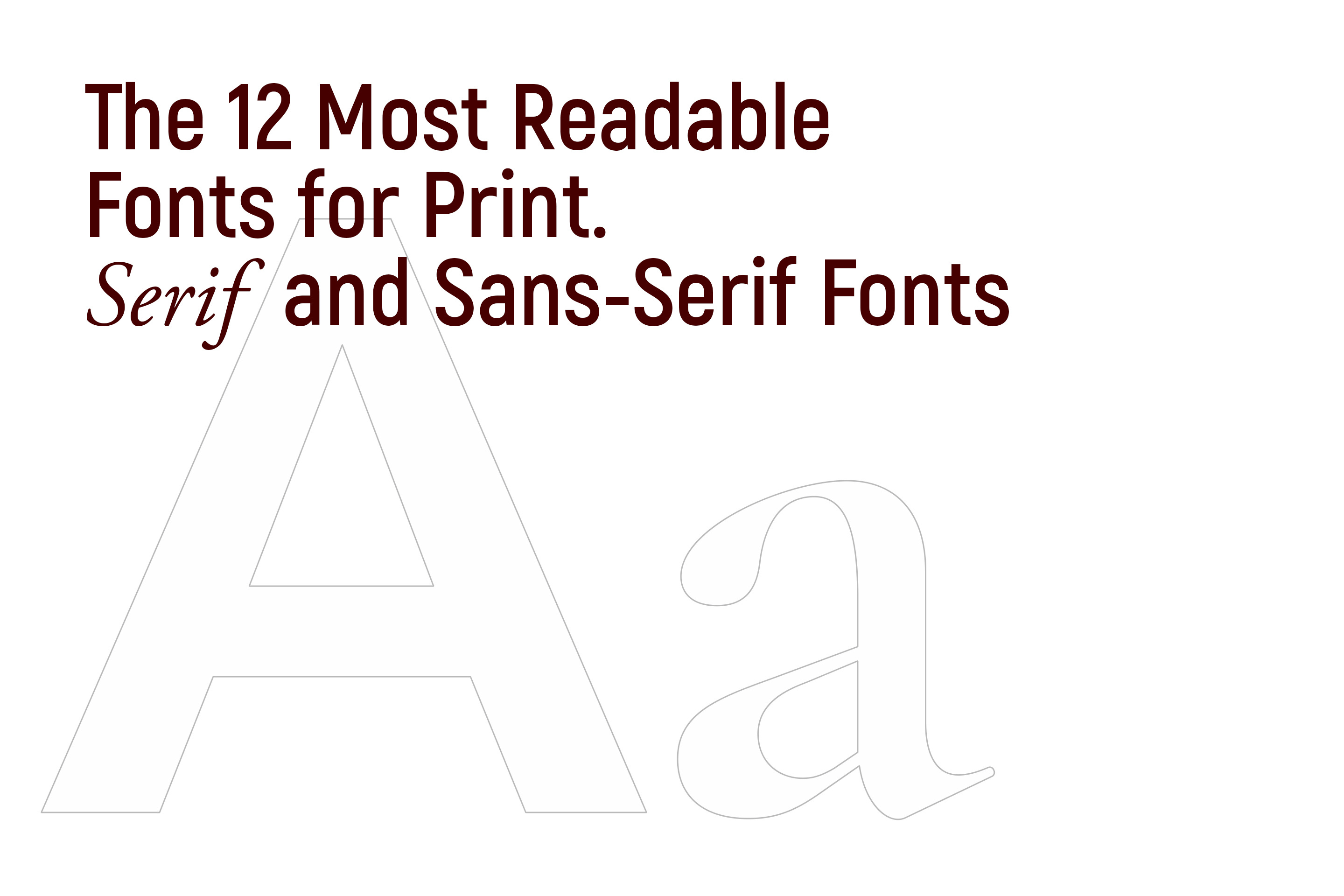
When it comes to choosing fonts for print materials, readability is of utmost importance. The right font can significantly impact your text's legibility and visual appeal. In this article, we'll explore 12 highly readable fonts for print, including both serif and sans-serif options. Let's dive in and discover the perfect font for your next print project!
Serif Fonts:
Times New Roman: As a classic serif font, Times New Roman is highly readable in print. It's well-defined serifs and moderate letter spacing make it popular for books, newspapers, and formal documents.
Garamond: Garamond is a timeless serif font with elegant letterforms. Its slightly condensed structure and balanced strokes contribute to its readability, making it suitable for longer texts, such as novels or academic papers.
Georgia: Designed specifically for on-screen legibility, Georgia also performs exceptionally well in print. It's sturdy serifs and generous letter spacing ensure excellent readability, even at smaller sizes.
Baskerville: Baskerville is a serif font known for its distinct character and legibility. Its refined letterforms, moderate contrast, and open counters make it an excellent choice for body text in printed materials.
Palatino: Palatino is a versatile serif font that strikes a balance between readability and elegance. Its generous x-height and open letterforms enhance legibility, making it suitable for various print applications.
Century Schoolbook: Century Schoolbook is a classic serif font with a traditional look and exceptional legibility. Its even stroke weight and generous spacing between letters make it a reliable choice for print materials.
Sans-Serif Fonts:
Arial: Arial is a clean and straightforward sans-serif font that offers excellent readability in print. Its uniform letterforms and ample spacing make it a reliable choice for a wide range of print materials.
Calibri: Calibri is a modern sans-serif font designed for optimal on-screen reading, but it also translates well to print. Its rounded letterforms and ample spacing contribute to its readability in printed texts.
Verdana: Verdana is a sans-serif font designed specifically for on-screen use, but it also performs admirably in print. Its larger x-height and wide letter spacing make it highly readable, even at smaller sizes.
Helvetica: Helvetica is a widely recognized sans-serif font known for its clarity and simplicity. It's even stroke width and balanced letterforms ensure excellent readability in various print materials.
Open Sans: Open Sans is a versatile and contemporary sans-serif font suitable for print applications. It's consistent letterforms and open design contribute to its legibility, making it a popular choice for body text.
Roboto: Roboto is a modern and geometric sans-serif font that offers excellent readability in print. Its clean lines, generous spacing, and well-defined letterforms make it suitable for various print materials.
When selecting a font for your print project, consider the overall tone, context, and target audience. Experiment with different fonts, sizes, and spacing to find the perfect combination that enhances readability and matches the aesthetics of your design.
Remember, readability is key in print materials, so choose fonts that are clear, legible, and easy on the eyes. The 12 fonts mentioned above, both serif and sans-serif, offer exceptional readability and can elevate the visual impact of your print designs. So, go ahead and choose the font that best suits your project, and create stunning printed materials that captivate your audience. Happy designing and happy printing!
There is a lot more to book design. If you feel you are not ready to jump into book design, I can certainly handle it! If you have any questions, please contact me.